In order to own the perfect CV, you must focus on several strategical points, which for sure include distinctive design, nice layout, well-structured and organised content and don’t forget to focus on what matters, keep it simple. Because when it comes to designing your CV – LESS IS MORE. Don’t worry, it is easier than you think.
Here are our 8 tips for being one step closer to the ideal CV:
Tip #1: More skills-focused CV
Concerning the content, never skip the “Skills” section in your curriculum vitae. Employers are changing their recruitment strategies and the focus of companies is now the skills set, including the hard and the soft skills of the candidates needed for a long-term success in a role.
Hard skills, also called technical skills, are specific to the particular job, relevant to each position and seniority level. Soft skills, on the other hand, are general characteristics, relevant to personality traits, which can make sense in certain jobs, while being less important in others.
Tip #2: CV targeted at specific job
You better have a distinctive CV design, but don’t underestimate the uniqueness of your content as well. Forget about the generic resume that you create and send out to a dozens of employers. Stand out and show them how uniquely qualified for the position you are.
We recommend careful examination of the job listing of the open position for keywords. These keywords are important and powerful tool if included in your CV as well, without using them excessively, of course, but they play a vital part in showing that you can handle the work if hired.
Tip #3: Choose the perfect font
Since your curriculum vitae is the first thing a potential employer will see, you want every aspect of it to speak to who you are. The font you choose for it plays a big role in what the reader will think about you. Using more than 2 different fonts can make your CV look unstructured and unprofessional.
The 2 most important categories of fonts are Serif and Sans Serif. Serif fonts are considered more classic and formal, while sans-serif fonts are often considered more minimalistic. Serif fonts are easier to read in print, while Sans Serif fonts are easier to read online.
If for example, you’re analytical and technical, try using a sans serif font, but also keep in mind that Sans Serif fonts are always the safe choice and definitely stay away from fonts like Comic Sans and Script.
Another point to emphasise is the font size. Always try to use bigger font size for the headings of the different sections. Having these distinct sections makes the design easy to navigate, allowing readers to quickly scan for information. You can also bold your text to make it look even more impactful and create a visual hierarchy. Set the spacing for 1.15 or 1.5. Make sure it’s consistent across your whole resume design.
Tip #4: Add visual emphasis to your info
As we mentioned, it is important for the reader to be able quickly and easily to find what matters for them as information. Using icons, makes your CV look more creative and at the same time helps for a fast navigation. Icons are often used instead of bullet points or where it is clear what you want to say with the help of one icon. You can also use it in place of a word, in the Interests section for example, where there is no need for a lot of details.
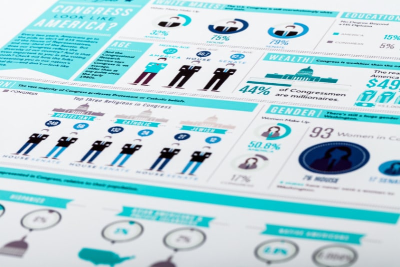
Infographics are also a good choice when we need to save space or to represent our information in a more pleasant and creative way.
Last but not least, using colors in your design and fonts can make your curriculum vitae stand out and tell more about your personality to the reader. Try not to use more than 2 colors or up to 3 if only one of the colors is an accent color.
Tip #5: Make content skimmable
The human brain is bombarded with content from the moment we wake up to the moment we go to sleep. So, we found a way to cope with all of it by skimming content to get the essence. CVs are no different. Research shows that HR representatives will spend about six seconds on your curriculum vitae. Make the most of it by ensuring your CV is skimmable. Don’t try to cram too much text into too little space.
It will also look easy to read if the content is divided into sections and only the most important and relevant information should be included with the help of bullet points. Make sure you have enough white space and avoid information overload. We suggest going for an extra space before and after every heading and each entry. In general, your resume should be no longer than a page.
Tip #6: Use the right file type
Always check the job description to ensure that resumes in PDF are accepted. PDF files help you keep your resume layout intact. Also, PDFs are a safer choice for infographic CV designs or others made with advanced graphic design software than JPG or PNG files. If not, you can always send a resume in Word or another format, but only if needed. Either way, having two CV file formats is always a good idea.
Plus, keep in mind that a great cover letter that matches your CV will give you an advantage over other candidates.
Tip #7: Simple design
When it comes to your CV, a simple design will always be more professional and effective than something unconventional that can also seem too extravagant and inappropriate for the particular job.
A major design resume trend to be mentioned is that many companies use applicant tracking systems (ATS) and it is going to be important for jobseekers to learn to use a resume format that is readable by ATS. However, a simple well-organized resume doesn’t mean it is a boring one to look at.
Tip #8: Interests section help you stand out
Your CV isn’t just about listing your former roles and skills, it’s also about how you will relate to the company culture proving your worth to the potential employer. While a strong job history does prove a certain level of competence in your field, it’s your hobbies and interests that will help you stand out from the rest of the competing candidates. Include only your interests and hobbies that you think align with the desired personality traits.


